|
|
Post by Will on Mar 3, 2013 17:27:58 GMT -5
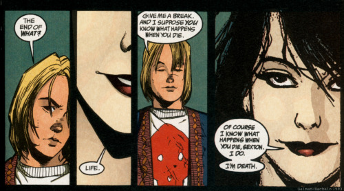
Something about your work for MSCSI has often reminded me of Chris Bachalo (who drew Shade the Changing Man and Neil Gaiman's Death comics in the 1990s) - I think it's the perky little noses and the details of hair, clothes and expression.  I hadn't thought of it before, but 2 or 3 reviews said your art was a lot like Scott Pilgrim. But you are not really a comics fan - so have you been shaped or influenced by any comic book art, or is this just coincidence? |
|
|
|
Post by Will on Mar 3, 2013 17:32:34 GMT -5
Oh hey I have another question for Suze.
You and I had a little discussion online about how you might actually virtually model Dahlia's house using software (or The Sims) so you could get the layout right and consistent.
I know Dave Gibbons had a very clear model of the key NYC intersection that he revisits several times in the art for Watchmen, so he'd get all the stores and streets correct in relation to each other.
Do you have any kind of model -- even if it's just a vague idea in your head -- of how Gloria is laid out, and where the university is in relation to the village, for instance?
Also, I've read interesting comments online that Gloria looks a little like Vancouver, rather than NYC. Did you base it on any particular 'downtown', or is this maybe an unconscious sense of Canadian cities?
|
|
|
|
Post by Suze on Mar 3, 2013 17:43:07 GMT -5
My question for Suze is: how did you start your career? Did you always want to become an illustrator? Hi Lucy, thanks for the question! My career path is a little wobbly and still ongoing. I've never been able to envision having a job that wasn't somehow creative, but it took me a while to narrow it down to wanting a job with both structure and creativity, as opposed to being a self-employed artist as many people from my university fine arts program went on to do. I'm still not quite at my goal of doing freelance illustration full-time, though I am lucky enough to have a day job around creative people as a background colourist at an animation studio. MSCSI is the first time I feel like there's an opportunity to do what I love to do, but professionally. Sorry if that answer's a little all over the place! I'm still figuring things out, but the short answer is that I feel like MSCSI itself is the start of my career  Which makes me all the more thankful to be able to work on it! |
|
|
|
Post by Will on Mar 3, 2013 17:47:16 GMT -5
Riven had a question, looking at the thumbnails of issue 1: we were wondering if page 7, panel 3 (the department store washrooms) was different in the thumbnails from the final version because I requested a change of composition, or because you decided on it... I couldn't remember!  |
|
|
|
Post by Beth on Mar 3, 2013 17:51:29 GMT -5
Is working as a colourist at an animation studio different to illustrating comics or artwork that osn't animated?
|
|
|
|
Post by Suze on Mar 3, 2013 17:55:47 GMT -5
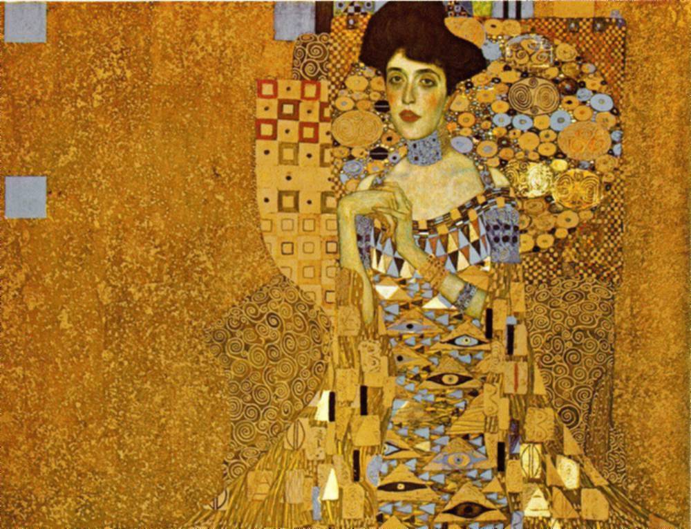
who are your favourite artists, and who has inspired you the most over the years? I've never been great at answering the inspiration part of this question, probably because of how much art I have access to on the internet and how easily I am inspired by beautiful work of all styles. One of my earliest inspirations though was Klimt, and I think his work still represents a good combination of the things I love in artwork. Namely an awesome use of realism vs stylization, knowing when to use empty space, and application of detail. For current favourite artists, the two that immediately come to mind are Faith Erin Hicks and Joshua Middleton. Their styles are vastly different - Faith Hicks on the comic side and Joshua Middleton tending more towards realism - but they both have excellent use of those elements listed above. I've also heard Ms. Hicks talk a couple times at conventions and her process and path to being a full-time comicker is as inspirational as her artwork! She's a darned hard worker who makes me want to work hard too at what I love. |
|
|
|
Post by Suze on Mar 3, 2013 18:09:21 GMT -5
I've got a couple of questions that have kind of come from listening to a Women in Comics panel at the Cardiff Comic Expo this weekend. One of the questions the panel asked was 'why do we need a women in comics panel in this day and age?' What would your answer be? One of the panellists said that she Louise want to be involved in a comic that's deliberately made up of all women she sees that as being more sexist. MSCSI has a predominantly female creative team and we know that was deliberate. How have you found working in a mostly female environment and what do you think about comics being deliberately made up of mostly women? What have you found most difficult about working on MSCSI? And what do you enjoy the most? I'm afraid my in-eloquence is going to show in this one, but I'll give it a shot! Ultimately I think that in a perfect world everything, comics included, would have a natural balance of women and men as contributors. But the sad truth is that comics are still very much a male-dominated industry (as Will's pointed out before, this is obvious by a once-over on a wall of comic-book covers), and female creative teams are a way to try and balance the scales by creating material that has a female voice and mindset. I'm happy and proud to be part of the MSCSI team, though I think that's primarily because we all have the same goals rather than our perceived genders. I'd be just as happy and proud to be part of a team consisting more evenly of men and women if it maintained the same mindset. The most difficult thing about working on MSCSI has been that I don't get to devote my weekdays to it! J/k though, beyond the challenge it's presenting artistically I'm finding it more difficult than I thought it would be to read criticism of the comic online. I've known for a while that the internet is a scary place but it doesn't make it any easier to think of someone disliking the series or characters. I'm trying to stay away from the comments section of articles. What I enjoy the most is getting to work with wonderful, talented people with whom I share a lot in common. It's making me very enthusiastic about the future of both MSCSI and comics in general. |
|
|
|
Post by Will on Mar 3, 2013 18:12:36 GMT -5
That is fascinating Suze, as I associate Chris Bachalo's art with Klimt -- I think there are definite similarities in the faces. There's also the fact that lots of people I knew around 1988-1993 (the prime time for Vertigo comics) had Klimt prints and postcards on their wall!  Hey guess what. I have a few more questions! 1. When I write the script, I have quite clear visual images in my head. When you read it, are you immediately getting an idea of composition, lighting etc, or does it come more when you start to sketch thumbnails? 2. Comic book artists are often weak at drawing i) horses ii) dogs iii) realistic looking women Which do you think is the hardest to draw? 2. What is your favourite panel in issue 1, and why? It could be because you think you did the best job on it, or it turned out best for some reason, or because of the colouring, or because everything (inks, words, colours) all pull together, or because of its place in the story. |
|
|
|
Post by Will on Mar 3, 2013 18:13:00 GMT -5
PS. I can't count to 3
|
|
|
|
Post by Suze on Mar 3, 2013 18:19:57 GMT -5
Another question for Suze. I was lazy at one point in the script for Issue 1 and just said something like 'we will need alternate-universe brand names here'. You went the extra mile and drew things like 'Lash Blast' mascara, "Libelor" (looks like a brand of blusher), and I think you also invented the Fantastic Flyers on page 2, so you've basically created a new superhero team. How did you come up with these little details of Cat's world -- spontaneously as you drew them, or did you plan any of it out? Generally though I just try to think of things I've previously seen/heard of within the item genre, then tweak them. The other blusher name, for example, is a sort of mash-up between Revlon and Maybelline. However Lash Blast is, it turns out, an actual brand name. Woops! I think I heard it somewhere, then forgot just enough to think it was a fake name. Or maybe after a while all mascara names just sound kind of the same. Having brand names on items though (preferably fake ones...) is another thing I feel makes a space and scene more real to the reader, so I enjoy including them. |
|
fennnaten
Cat People
 watercolor avatar made by Cleox ( http://cleox.deviantart.com/ )
Posts: 28
|
Post by fennnaten on Mar 3, 2013 18:21:05 GMT -5
Hi Suze !
I have a question in mind: when reading through what we now about the comics for the moment (including some things happening on twitter or on the Urbanite's blog), Gloria seems depicted as a character as well as a background for the story. Does that double nature affects your creative process and your drawing in some way ?
|
|
|
|
Post by Suze on Mar 3, 2013 18:25:38 GMT -5
Hi Suze! Question of my own--as the time period's early 90s, how much inspiration or reference (if any) did you take from design/style/architecture of that period when you started putting together details for backgrounds? When it comes to 90s-specific reference, I've mostly been using it for characters' outfits. I feel like the change in architecture and general design has been subtle enough between the 90s and present day that I can use any reference imagery and not worry too much about it not looking like the intended time period (though I'm sure anyone who knows more about auto-makes, building, industrial design, etc would tell me otherwise). Clothing though is a fairly recognizable thing from decade to decade, so I've been trying to keep it accurate. On that note, it turns out it's kind of difficult to google 90s fashion thanks to the ever-current nature of the internet! A lot of what ends up in the result is '90s inspired' clothing, so I've had to flex my google-fu to weed out impostors. |
|
|
|
Post by Suze on Mar 3, 2013 18:33:47 GMT -5
Wow, tons of questions! And a few I was thinking of asking already, but I'll throw another in there. Did you always know you wanted to work with sequential art or was that a later realisation? I imagine there's a different skill set at work making sure your art works sequentially in addition to looking gorgeous - was that something that came naturally to you? I ask as a fascinated person who can't draw anything, let alone stories.  Wanting to work with sequential art has been a pretty recent realization, though I was looking through my computer archives and realized that I've been drawing comics about my own life for nearly 10 years now. So I'm just a slow to the punch it seems! I don't have any formal education in sequential art, but have tried to pick up tips from the internet and reading comics. Something I've been trying to do more often is to think about the scene in a cinematic way, then translate that to the page. Don't let an undeveloped skill set stop you!  The reason my personal comics are almost exclusively based on daily events is that I am in no way a writer. And this probably helped, since when I want to tell people about events it's more instinctive for me to draw it out rather than write it down. Though writing is a weak point for me I would like to work on it, as the only way to get better at something is to do it and improve as you go. In the immortal words of Jake from Adventure Time, "Sucking at something is the first step to becoming sorta good at something!" |
|
|
|
Post by Suze on Mar 3, 2013 18:45:02 GMT -5
Something about your work for MSCSI has often reminded me of Chris Bachalo (who drew Shade the Changing Man and Neil Gaiman's Death comics in the 1990s) - I think it's the perky little noses and the details of hair, clothes and expression.  I hadn't thought of it before, but 2 or 3 reviews said your art was a lot like Scott Pilgrim. But you are not really a comics fan - so have you been shaped or influenced by any comic book art, or is this just coincidence? I find it really funny when people equate my art in any way to Scott Pilgrim, as I find them nothing alike! I love Bryan Lee O'Malley's style, so I suppose I'm flattered, but honestly can't see the basis for the comparison. I've read a few comic books but the main appeal for me has always been in graphic novels, possibly because I enjoy self-contained stories more than series or because of the wider range of art styles they seem to be available in. I feel like I've been shaped one way or another by everything I've ever read (except for Filler Bunny, it was kind of upsetting) but in terms of direct influence I'd have to say a lot of it is coincidence. Though after seeing those panels you've posted I'd be really interested in reading the full comic, as I can see what you mean by the stylistic similarities! |
|
|
|
Post by Suze on Mar 3, 2013 18:49:43 GMT -5
Oh hey I have another question for Suze. You and I had a little discussion online about how you might actually virtually model Dahlia's house using software (or The Sims) so you could get the layout right and consistent. I know Dave Gibbons had a very clear model of the key NYC intersection that he revisits several times in the art for Watchmen, so he'd get all the stores and streets correct in relation to each other. Do you have any kind of model -- even if it's just a vague idea in your head -- of how Gloria is laid out, and where the university is in relation to the village, for instance? Also, I've read interesting comments online that Gloria looks a little like Vancouver, rather than NYC. Did you base it on any particular 'downtown', or is this maybe an unconscious sense of Canadian cities? As we get more into the comic and keep revisiting locations, I think I will put in the time to lay down - at least roughly - where things are in relation to each other. I don't have a sense of it at the moment (I have a bad spacial mind, it's taken me an embarrassing amount of time to learn where things are in the city I've lived my whole life) but am a stickler for consistency and would hate to mess it up in MSCSI. It would be like seeing a continuity error in a movie; It takes you out of the moment by reminding you that what you're seeing isn't real. Also, it's interesting that Gloria seems to look more like Vancouver! I specifically googled NYC for the 'busy city' look and haven't been to Vancouver since I was young, so it must just be my innate Canadian-ness sneaking in. |
|